Artwork Requirements
To get your design ready for printing and ensure there are no delays, there are a few key things you need to know before sending your artwork.

PROVIDE A HIGH-RESOLUTION FILE
High quality files are super important to ensure your artwork prints clearly. There are two important artwork formats to remember.
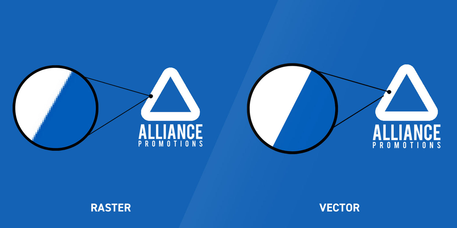
VECTOR
Vector files are the most commonly used file type for fonts, logos and graphics. Typical vector file formats include .ai, .pdf and .eps and are typically created using programs such as Adobe Illustrator.
Vector files allow us to resize, adjust or edit files where required and maintain their quality when magnified.
RASTER
Raster files (also called bitmap) are typically photographs. Typical raster file formats include .jpg, .tiff, .psd, .png and .gif.
Raster images are made up of tiny squares (pixels) of colour and when grouped together they form a rastered image. Raster images are the most common images you can find on your computer and the web. The resolution (measurement of pixels) is often kept as low as possible for viewing on a screen and therefore these images do not maintain their quality when magnified.

CREATE ALL TEXT TO OUTLINES.
There are so many fonts available, so we recommend creating your text to outlines to ensure we print the correct font based on your brand guidelines.
Speaking of brand guidelines – make sure to send us these where possible so we can help you stay on brand!

CREATE ALL TEXT TO OUTLINES.
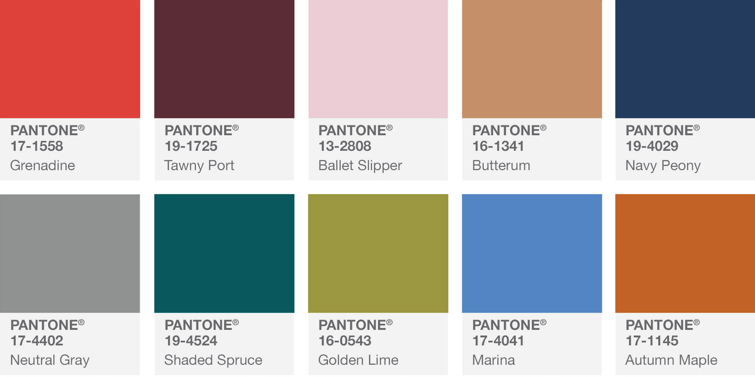
We often use universal PMS (Pantone Matching System) colours to refer to your artwork. Make sure you know your brands closest PMS colour so we can ensure all your different vessels match. This sometimes involves slightly changing this colour according to the substrate.
Wondering why you see a letter after your PMS colour?
Pantone have two colour matching systems.
C = Coated (most commonly used, coated colours refer to stock colours that have a gloss/shiny coating and often appear more opaque)
U = Uncoated (These colours refer to stock colours that do not have a coating. The ink is absorbed by the substrate and therefore the colour appears less bright/opaque).
It’s important to understand that despite using the same PMS colour different items are likely to appear as slightly different shades. For example your PMS colour will look a little different printed directly on a glass bottle than it will look printed on your matte finish kraft boxes. Additionally, don’t forget that PMS colours can also appear differently on screens. It’s always best where possible to compare products to physical colour charts to maintain consistency.
